Saturday, December 14, 2013

Week 15 Visual Design Techniques


In this image you will find:
Balance
Unity
Stasis
Economy
Simplicity
Subtlety
Neutrality
Opacity
Accuracy
Sharpness
In this image you find:
Balance
Unity
Stasis
Economy
Symmetry
Regularity
Simplicity
Subtlety
Consistency
Juxtaposition
Sequentiality

These are a variety of  visual techniques that are similarities between these products. The Balance is carried through in each of the images with the visual statement that the products are trying to communicate. From the smooth lines of the car to the organic shape of the prosthetic. In addition to this, each of the images have a unity amongst them. The car carries this really well because we forget that it is actually made of thousands of components to make it into what we see on the screen, a "simple" automobile. Although there are unifying elements in the prosthetics, the juxtaposition of the 2 halves that make the assembly also highlights the difference in materials. Another similarity is that each of these are in a stasis state, where as in reality both of these components are designed to be moving. The major differences between these images is the juxtaposition of the components of the prosthetic components compared to the relative singularity of the car with its overwhelming darker colors. Other differences lie within the design of the products themselves, whereas the car is a large organic shape with no obvious patterns aside from the shape being organic and the overwhelming presence of the dark color, there are no sequential patterns here, whereas with the Prosthetic there are sequential patterns within the design of the cut outs.


Sunday, December 8, 2013

Week 14 Contrast

The dynamics of colors on the logo create a counter action toward the leveling and harmony of this logo. Although the eyes are drawn initially to the boldness of the "Wear", the dark border and relative scale of having 2 words "Vision Street" above  the word "Wear" balance the over all look of the logo. The lightness and darkness of the tones also give off more of an intensity between dynamics of the wording. In addition to this the equal division of tone could still be seen despite the juxtaposition of white background of the "Vision Street" and  the dark background of the "Wear". The effectiveness of all these contrasting elements creates a harmonious logo for one to appreciate.

Although the color of the bike and composition of the photo suits the branding for its name, Black Sheep, unfortunately the low contrast makes it difficult for the consumer to decipher what the actual brand of bike they are looking at. The clarity is lost as well with the lack of juxtaposition of the dark grey bicycle and the black background. This continues throughout the composition of this advertisement with the white logo of the bicycle being lost amongst the light grey frame. Although the photo is intriguing on the merit of going along with the name of the bike, it would take someone who already has a prior knowledge of the bicycle to realize what brand is being sold.


Monday, December 2, 2013

Week 13 Design Success and Failure / Syntactical Guidelines

Design Success Syntactical Guidelines
One career goal that I have, is to work for Tesla Motor. Tesla is both an electric car company in addition to the last name of Nikola Tesla who invented the Electric Tesla Coil. Tesla's logo and their name perfectly suits the overall branding of the company and meets the look of their targeted user. From the brands focus on only having electric cars to shape of the "T" of their logo being a similar shape to the actual tesla coil, the logo and company captures the essence of a fully balanced image that even a non appreciator of cars or branding could appreciate.

Electric Tesla Coil in Action

"T" Profile Shape of the Tesla Coil
Tesla electric car
Design Failure Syntactical Guidelines
This logo try to capture the sense of movement with the slant and American pride with the Red White and Blue logo. But this logo in no way captures the essence of the great bicycle company Redline is. The logo is better suited for a company that is making American Flags or possibly even making their products here in the US, but if anything colors gives off a false sense of advertising and may alienate bicyclist that live outside the US,

Saturday, November 9, 2013

Week 11, Implied Movement


The curves throughout this train station creates the implied illusion of movement. The railing keeps the viewer attention concentrated within the photo creating an illusion of a never-ending spiral.The Gestalt Law of continuum is in effect with the railing and linear perspective in this photo, drawing the viewer further towards the center of the photo adding to its composition. The variation of scales, from the people standing along the side of the road on the lower right of the photo to the end, communicate movement and change because of their relative size comparison to the facade out front.


http://media-cache-ak0.pinimg.com/736x/da/d1/5e/dad15e8e95d65b3b3baf88e3f5a0083e.jpg

The swooping shape of the semis on end creates the implied illusion of movement with Direction (curve derived from the circle shape) implying a rolling movement. First, with the reality of what doesn’t seem to be physically possible to achieve, with the semi balancing nose end, there is an expectation that the semi is going to roll over. Added to this, the implied motion one has when they see the curved shape of the Semi Tanks, the semi looks like it is going to roll over onto the crowd. Implied movement is also seen in the curvature of the tank spine which guides the viewers attention from the tail to the nose and vice versa.


Saturday, October 26, 2013

Week 9, Tone and Color


How Tone is operating.

The lighting in this photo helps the way that tone is being operated. The light reflected off the cars shiny curved surface, gives the color a larger spectrum of tonality. The tonality of the back drop helps define the horizon and also helps also ground the car.

How Tone is interacting.

The changes of lightness and darkness, present throughout this photo, helps with the composition and helps us to define what it is that we are seeing. It help give the car dimensionality, perspective and the overall reality as to what we are looking at. Without it we have no representation to the image that we are looking at.

How Color is operating.

The red on the gives the car a sense of warmth and richness. Richness in terms of both the depth of the color and to the quality and prestige of the car. The color of the surface and skyline is relatively muted, drawing the viewers attention even further into the car.

How Color is interacting.

Color in this photo gives meaning to what the viewer is interacting with. The muted colors of the backdrop along with the vibrant colors of the car interact with one another to draw even further attention to the car. The blueish tone of the back drop "cools" the photo while the red of the car brings out the fire, creating a dynamic of what is called "simultaneous contrast".


Tuesday, October 22, 2013

Week 8, Product Development

Design Element, The shape


 In this photo of the "Zero" track bike, the shapes that are prominent throughout the photo are what help define the overall appeal of the bike. The triangle towards the front of the bike help define the action of the photo, by giving the bicycle a more overall aerodynamic look and emphasizing the speed which the end user could potentially reach The triangles that are within the frame create the tension because of the unconventional shape . The circles not only help define the endless rotation that the wheels and bottom bracket are going to foresee, but also are reminiscent of the branding of the bicycle as well.


Design Element, The Color


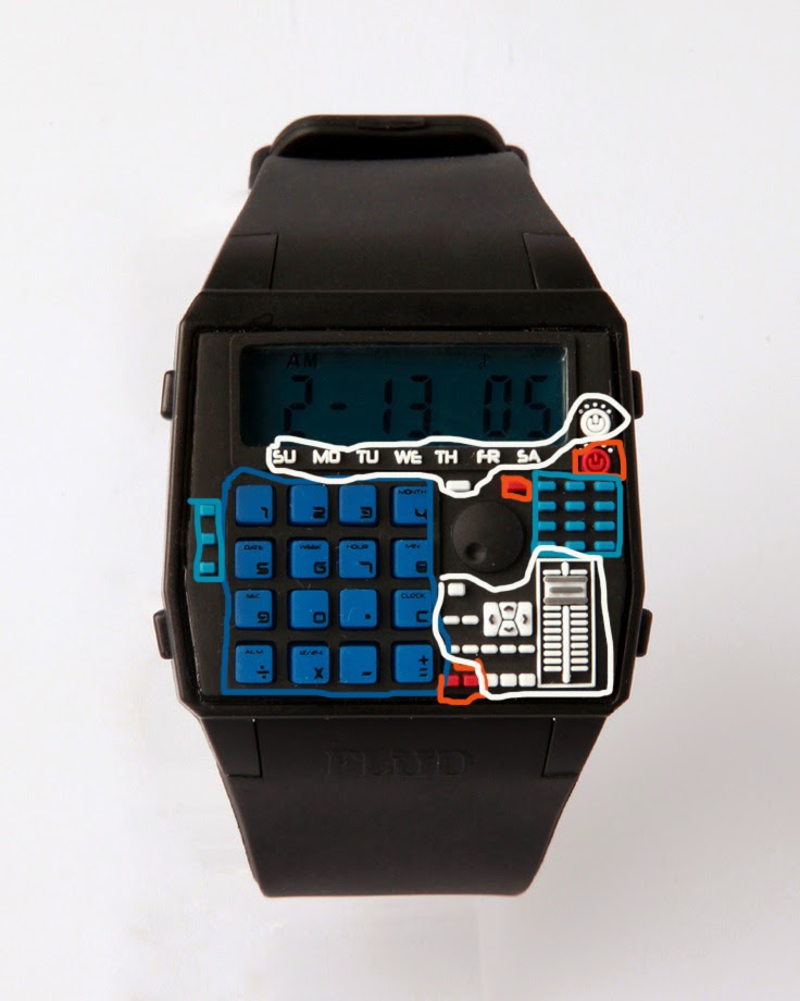
The dynamics of the colors on this calculator watch help personify both the dynamics of the futuristic look of the watch while also embodying the retro-ness. The blues calms the viewer, while the hints of red give it an edginess. These 2 extremes of feelings and colors are brought together by the balance of the white color, which also helps capture the overall look and feeling of the watch.


Design Elements, The Line


Although the lines highlighted are only emphasizing the outline of the chair, the remaining lines also serve to give motion, by directing the viewers eyes in a roller coaster type fashion,  helping complete the look and shape of the chair.

Tuesday, October 15, 2013


Subject 1, The Cat

Subject 2,The Cat

Each of the subjects employed the “finding method” of trying to figure out how many triangles there are on the cat. Subject 1 was more methodical and subdivided each portion of the cat and crossed it out each section. Although Subject 2 did similar of “finding” each of the triangles, the approach was more “top down”, starting with the head, moving down to the body, then onto the tip of the tail.