Saturday, October 26, 2013

Week 9, Tone and Color


How Tone is operating.

The lighting in this photo helps the way that tone is being operated. The light reflected off the cars shiny curved surface, gives the color a larger spectrum of tonality. The tonality of the back drop helps define the horizon and also helps also ground the car.

How Tone is interacting.

The changes of lightness and darkness, present throughout this photo, helps with the composition and helps us to define what it is that we are seeing. It help give the car dimensionality, perspective and the overall reality as to what we are looking at. Without it we have no representation to the image that we are looking at.

How Color is operating.

The red on the gives the car a sense of warmth and richness. Richness in terms of both the depth of the color and to the quality and prestige of the car. The color of the surface and skyline is relatively muted, drawing the viewers attention even further into the car.

How Color is interacting.

Color in this photo gives meaning to what the viewer is interacting with. The muted colors of the backdrop along with the vibrant colors of the car interact with one another to draw even further attention to the car. The blueish tone of the back drop "cools" the photo while the red of the car brings out the fire, creating a dynamic of what is called "simultaneous contrast".


Tuesday, October 22, 2013

Week 8, Product Development

Design Element, The shape


 In this photo of the "Zero" track bike, the shapes that are prominent throughout the photo are what help define the overall appeal of the bike. The triangle towards the front of the bike help define the action of the photo, by giving the bicycle a more overall aerodynamic look and emphasizing the speed which the end user could potentially reach The triangles that are within the frame create the tension because of the unconventional shape . The circles not only help define the endless rotation that the wheels and bottom bracket are going to foresee, but also are reminiscent of the branding of the bicycle as well.


Design Element, The Color


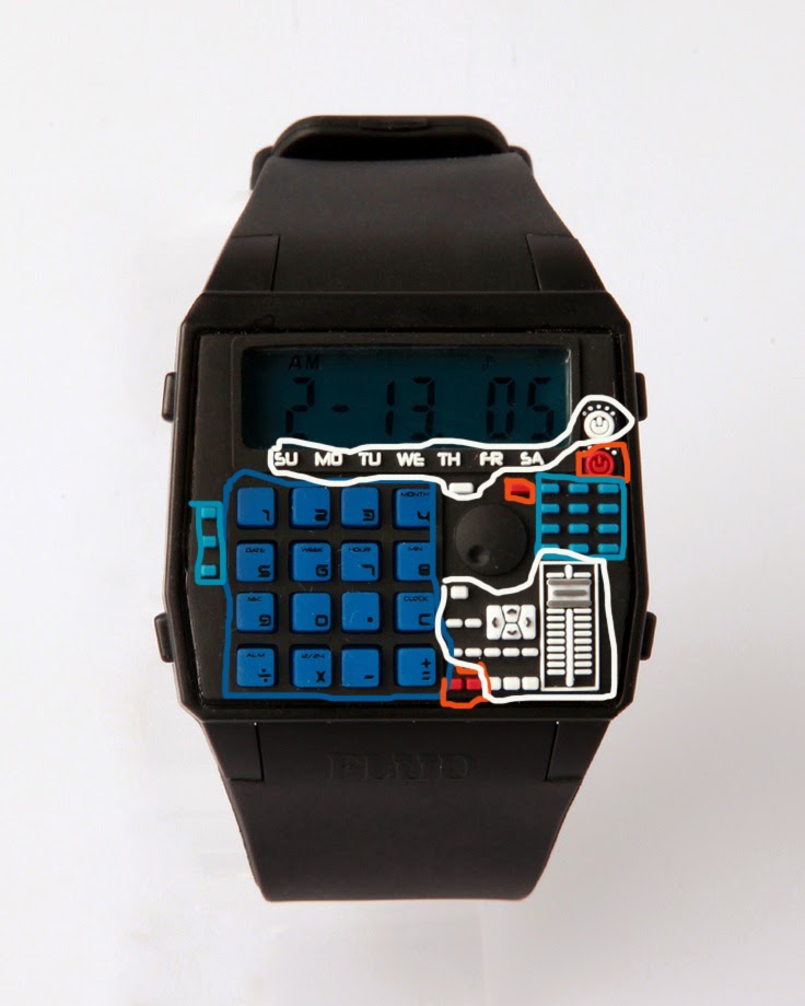
The dynamics of the colors on this calculator watch help personify both the dynamics of the futuristic look of the watch while also embodying the retro-ness. The blues calms the viewer, while the hints of red give it an edginess. These 2 extremes of feelings and colors are brought together by the balance of the white color, which also helps capture the overall look and feeling of the watch.


Design Elements, The Line


Although the lines highlighted are only emphasizing the outline of the chair, the remaining lines also serve to give motion, by directing the viewers eyes in a roller coaster type fashion,  helping complete the look and shape of the chair.

Tuesday, October 15, 2013


Subject 1, The Cat

Subject 2,The Cat

Each of the subjects employed the “finding method” of trying to figure out how many triangles there are on the cat. Subject 1 was more methodical and subdivided each portion of the cat and crossed it out each section. Although Subject 2 did similar of “finding” each of the triangles, the approach was more “top down”, starting with the head, moving down to the body, then onto the tip of the tail.
Subject 1, "The Rule"


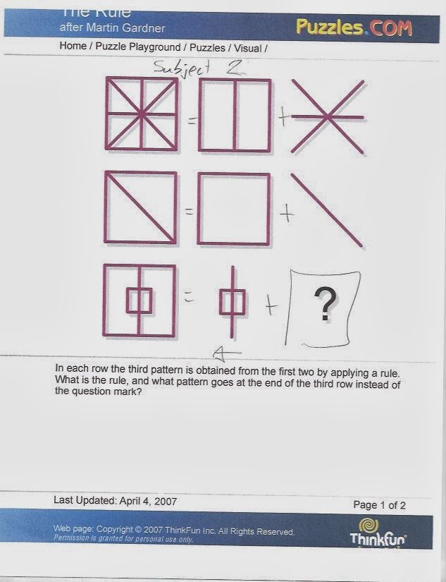
Subject 2, The Rule


Subject 1 followed a “pattern completion” methodology of trying to figure out the puzzle.  Her line of site moved from left to right to solve the puzzle. Similar to what McKim states, she is ""filling in" [the] incomplete pattern and... "finding" a desired pattern embedded""  with the flow of the shapes moving her line of site from left to right. She visualized this pattern that was removed from Column 1 and deciphered it to figure out the end result of Column 3. Subject 2 also followed a “pattern completion” methodology of trying to figure out the puzzle but his line of site traveled from right to left, in a manner that was more of an addition problem. His perception imagined what shape was needed to complete the shape for Column 1.